The debate around competitiveness in tennis often leans on perception. But strip it back to the numbers, and a clearer picture emerges.
A statistical comparison of the current Top 20 rankings in both the WTA and ATP Tours reveals a compelling truth: while men’s tennis is increasingly shaped by elite dominance, the women’s game is defined by both depth—and resistance to that dominance.
And the difference is measurable.
Table of contents
- A Tale of Two No.1s
- Elite Dominance: ATP Pulls Away Early
- Top 5: Where the Tours Converge
- The Real Difference Lies in Depth
- Measuring Inequality: The Gini Factor
- Bigger Gaps, Bigger Divide
- When Weighting the Rankings, the Pattern Holds
- The Verdict: Depth vs Dominance
- Methodology: How the Comparison Was Calculated
A Tale of Two No.1s
Aryna Sabalenka leads the WTA rankings with 11,025 points—a commanding total. Yet her share of the Top 20 pool stands at just over 12%.
Carlos Alcaraz, by contrast, controls nearly 15% of all ATP Top 20 points.
That difference may seem marginal, but it sets the tone for everything that follows.
Elite Dominance: ATP Pulls Away Early
The contrast sharpens when looking at the Top 3.
On the ATP side, Carlos Alcaraz, Jannik Sinner, and Alexander Zverev combine to control nearly 34% of all Top 20 points.
In the WTA, Aryna Sabalenka, Elena Rybakina, and Coco Gauff account for just over 29%.
That gap highlights a key structural difference: men’s tennis is currently more concentrated at the very top, driven heavily by the exceptional output of Alcaraz and Sinner.
Top 5: Where the Tours Converge
Expanding the lens to the Top 5 reveals a more balanced picture.
The ATP Top 5—Alcaraz, Sinner, Zverev, Novak Djokovic, and Lorenzo Musetti—hold 43.78% of total points.
The WTA Top 5—Sabalenka, Rybakina, Gauff, Iga Swiatek, and Jessica Pegula—sit almost identically at 43.99%.
Here, the tours converge. The difference lies not in the overall weight of the elite tier, but in how that weight is distributed.
On the ATP side, dominance is more front-loaded. On the WTA side, it is spread more evenly across the Top 5.
Stripping Out the Super-Elite: A Top 8 Without the Top 2
To better understand the underlying competitiveness of each tour, we remove the two dominant outliers—Sabalenka & Rybakina (WTA) and Alcaraz & Sinner (ATP)—and focus on the next tier.
This leaves us with a “Top 8 without Top 2” group (ranks 3–10).
Results
- WTA (Ranks 3–10): ~47.9% of total Top 20 points
- ATP (Ranks 3–10): ~37.5% of total Top 20 points
This is where the difference becomes striking.
Once the very top is removed, the WTA’s upper-middle tier carries significantly more weight than the ATP’s.
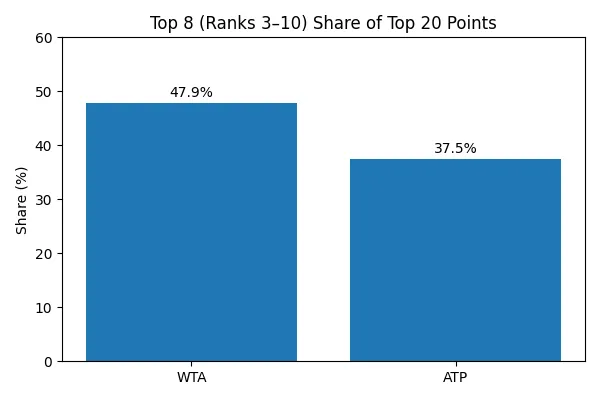
What It Means
- The WTA has a stronger competitive core just below the elite
- The ATP relies far more heavily on its top two players
- The gap between ranks 3–10 is much tighter in the WTA
In effect:
Remove the superstars, and the women’s tour looks deeper, stronger, and more balanced.
The Real Difference Lies in Depth
Where the WTA again separates itself is beyond the elite tier.
Players ranked 10 to 20—featuring names like Mirra Andreeva, Karolina Muchova, Naomi Osaka, and Madison Keys—account for 30.87% of total WTA Top 20 points.
On the ATP side, where the lower Top 20 includes players such as Daniil Medvedev, Casper Ruud, Andrey Rublev, and Frances Tiafoe, that figure drops to 29.73%.
It’s a subtle but meaningful edge—one that reflects a stronger middle class in the women’s game.
Measuring Inequality: The Gini Factor
To quantify this properly, we turn to the Gini coefficient, a standard measure of distribution inequality.
- ATP Gini: ~0.41
- WTA Gini: ~0.36
The conclusion is clear:
The ATP rankings are more unequal—more concentrated among a handful of players—while the WTA is more evenly spread.
Bigger Gaps, Bigger Divide
Standard deviation reinforces the same story.
The ATP rankings show a spread of roughly 3,200 points, compared to around 2,450 on the WTA.
That means larger gaps between players in the men’s game, while the women’s rankings remain tighter and more fluid.
When Weighting the Rankings, the Pattern Holds
Even when applying a weighted model—giving greater importance to higher-ranked positions—the ATP still comes out ahead.
Not because of overall depth, but because of the sheer strength of its top tier.
It’s a system currently driven by elite concentration.
The Verdict: Depth vs Dominance
The data doesn’t just challenge perception—it reshapes it.
Men’s tennis, in its current form, is top-heavy, defined by a powerful leading group and a steep gradient beneath them.
Women’s tennis tells a different story.
Women’s tennis is broader, tighter, and more competitive across the Top 20.
Not necessarily lacking stars—but less dependent on them.
And in an era where consistency is harder to maintain than ever, that depth might just be the WTA’s greatest strength.
Conclusion
If the ATP’s top two define their era through separation, the WTA’s leaders are defined by resistance—holding their ground against a deeper, more crowded field.
Methodology: How the Comparison Was Calculated
To ensure a fair and statistically robust comparison between the ATP and WTA Top 20 rankings, multiple normalization and distribution metrics were applied.
1. Total Points Normalization
All player points were first aggregated:Total Points=i=1∑20Pi
Each player’s contribution was then expressed as a share of the Top 20 pool:Normalized Sharei=∑i=120PiPi
This removes scale bias and allows direct comparison between both tours.
2. Concentration Ratios (CR)
To evaluate how much influence top players exert, cumulative shares were calculated:CRn=i=1∑n∑i=120PiPi
Where:
- CR1 = Top 1 share
- CR3 = Top 3 share
- CR5 = Top 5 share
These metrics reveal how “top-heavy” a ranking system is.
3. Depth Index
To evaluate how competitive the rankings remain beyond the very top, the Depth Index focuses on players ranked 10 to 20—effectively the “middle class” of the Top 20.Depth Index=∑i=120Pi∑i=1020Pi
Rather than looking at headline dominance, this metric captures how much of the total points pool is held by players outside the elite tier.
A higher Depth Index means that a larger share of points is distributed among players ranked 10–20. In practical terms, this indicates:
- Smaller gaps between players
- Greater week-to-week competitiveness
- Less reliance on a handful of top-ranked stars
A lower value indicates a sharper drop-off after the Top 10, with the majority of points concentrated among the leading players.
In this analysis, the Depth Index reveals whether a tour relies on broad competitiveness or is driven primarily by elite dominance (see also 9).
4. Weighted Ranking Model
To emphasize the importance of higher-ranked players, a linear weighting system was applied:Weighted Score=i=1∑20(Pi×Wi)
Where:
- Wi=21−i (Rank 1 = 20, Rank 20 = 1)
This model amplifies elite dominance and tests how much the top of the ranking drives the overall structure.
5. Standard Deviation (Spread of Points)
Standard deviation measures how spread out the points are across players.
In simple terms:
Standard deviation tells you whether players are clustered close together in points—or far apart with big gaps between them.
To measure variability across rankings:σ=n1i=1∑n(Pi−μ)2
Where:
- μ = mean points
- n=20
A higher standard deviation indicates larger gaps between players.
6. Gini Coefficient (Key Inequality Measure)
The Gini coefficient quantifies how evenly points are distributed across the Top 20.
It is derived from the Lorenz Curve, which plots:
- X-axis: cumulative % of players
- Y-axis: cumulative % of points
The Gini is calculated as:G=1−2∫01L(x)dx
In discrete form (used here):G=2n2μ∑i=1n∑j=1n∣Pi−Pj∣
Where:
- Pi,Pj are player points
- n=20
- μ = mean points
7. How to Interpret Gini in Tennis Rankings
- G ≈ 0 → perfectly equal distribution (all players have similar points)
- G ≈ 1 → extreme inequality (one player dominates everything)
In ranking terms:
- Higher Gini (ATP)
→ Points concentrated among fewer players
→ Greater dominance at the top - Lower Gini (WTA)
→ More even distribution
→ Greater depth and competitiveness
8. Why Gini Matters Here
Unlike simple averages or totals, the Gini coefficient captures the shape of the ranking ecosystem.
It answers the key question:
Are points earned broadly across many players—or concentrated among a few?
In this analysis, it served as the central statistical proof behind the structural differences between the ATP and WTA Tours.
9. Top 8 (Excluding Top 2)
To isolate the competitive strength beneath the very top, we compute the share of points held by players ranked 3 through 10:Adjusted Top 8 Share=∑i=120Pi∑i=310Pi
Why Exclude the Top 2?
Top-ranked players can act as statistical outliers, disproportionately influencing:
- Concentration ratios
- Gini coefficient
- Overall distribution shape
By removing them, we:
- Reduce skew from extreme values
- Focus on the true competitive structure of the field
- Reveal how strong the tour is beyond its 2 biggest stars
Interpretation
- Higher value (WTA)
→ Stronger and more influential upper-middle tier
→ More players capable of competing near the top - Lower value (ATP)
→ Greater dependence on elite dominance
→ Steeper drop-off after the very top
Why This Metric Is Powerful
This adjusted view answers a deeper question:
How competitive is the tour once you remove its biggest outliers?
And in this case, it clearly shows once again:
The WTA’s strength lies not just in depth—but in the quality and weight of its chasing pack.